CHATTER is a tool that shows how air pollution levels change over time and what those changes could mean for people’s health in the Beaumont, Port Arthur area. While air pollution affects everyone, communities nearer industrial sources experience higher levels of hazardous air pollutants and the associated human health risk than those that are not.
CHATTER helps determine whether air pollution levels measured at local monitors may be high enough to affect human health and whether additional action may be needed to reduce exposures. Screening levels are air pollution concentrations or thresholds that scientists use to identify when long-term exposure may increase the risk of health problems. Exceeding a screening level does not mean health effects will occur, it indicates a need to take additional steps like verifying measurements or taking pollution reduction actions to protect health.
The health risks CHATTER show apply to a resident living in the area breathing air pollution for a long time.
CHATTER displays three groups of air pollutants that are monitored in Beaumont/Port Arthur:
- Cancer Risk Air Pollutants: these are hazardous air pollutants that increase the lifetime risk of developing cancer.
- Other Health Risks Pollutants: these are hazardous air pollutants that increase the risk of other health conditions — for example heart, breathing, immune, and reproductive effects — other than cancer.
- EPA Criteria Pollutants: these are six common air pollutants regulated under the Clean Air Act for which the EPA has set National Ambient Air Quality Standards (NAAQS) because they can affect people’s health. Four of these common air pollutants are measured at monitors near this community.
The first two groups are of greater concern to communities living near industrial areas, where hazardous air pollutants are released. The third group consists of widespread pollutants found throughout the United States.
A reference map is included indicating the locations of the monitors. Figures in CHATTER reports are based on air monitoring data from these locations. If you are interested in better understanding potential sources of air pollution at these locations, visit EDF’s AirTracker tool.
For more on definitions or how air monitors work, what a screening level is, how EPA sets them, and which statistics CHATTER uses, see the Frequently Asked Questions. Where the data come from, how each number is calculated, and a downloadable file of every value on this site are on the Data & Methods tab.
How to read the plots on this page (click to expand)
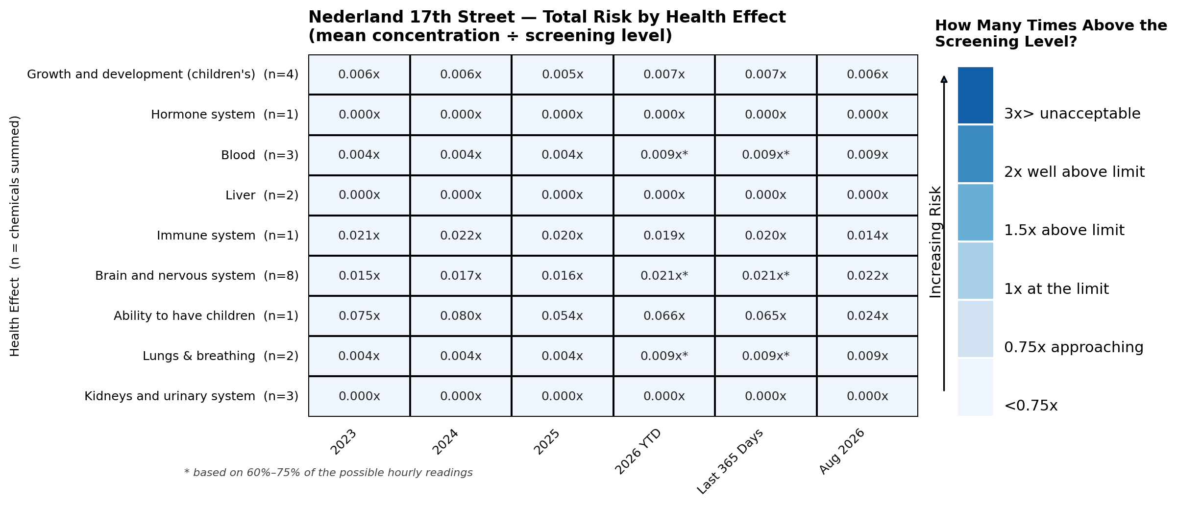
The figures below are heat maps. Each figure shows changes in air pollution=related health risks at an air monitor location. Each row shows an air pollutant or a health effect, each column is a period of time, and the number in each square is the level measured at the location divided by the health-based limit, written as a multiple with an “x.” 1.0x means the level sits exactly at the limit; 0.5x is half the limit; 3.0x is three times the limit. The color legend beside each plot shows what those multiples mean. The darker the color the greater the value. A number followed by an asterisk (for example 1.72x*) rests on thinner data: between 60% and 75% of the possible hourly readings for that period were available. Periods with less than 60% are left blank rather than shown.
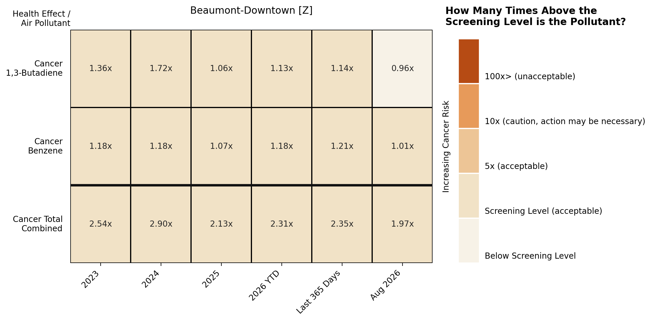
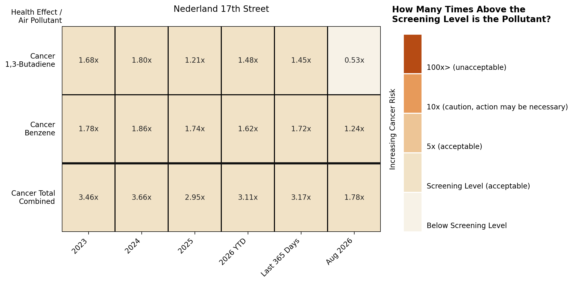
Cancer Risk Pollutants compares each pollutant against the Screening Level, with the two monitors side by side. For example, 1,3-butadiene at Beaumont-Downtown in 2024 reads 1.72x — a little over one and a half times the screening level, but still within the government’s acceptable range. The bottom row combines the pollutants into a total.
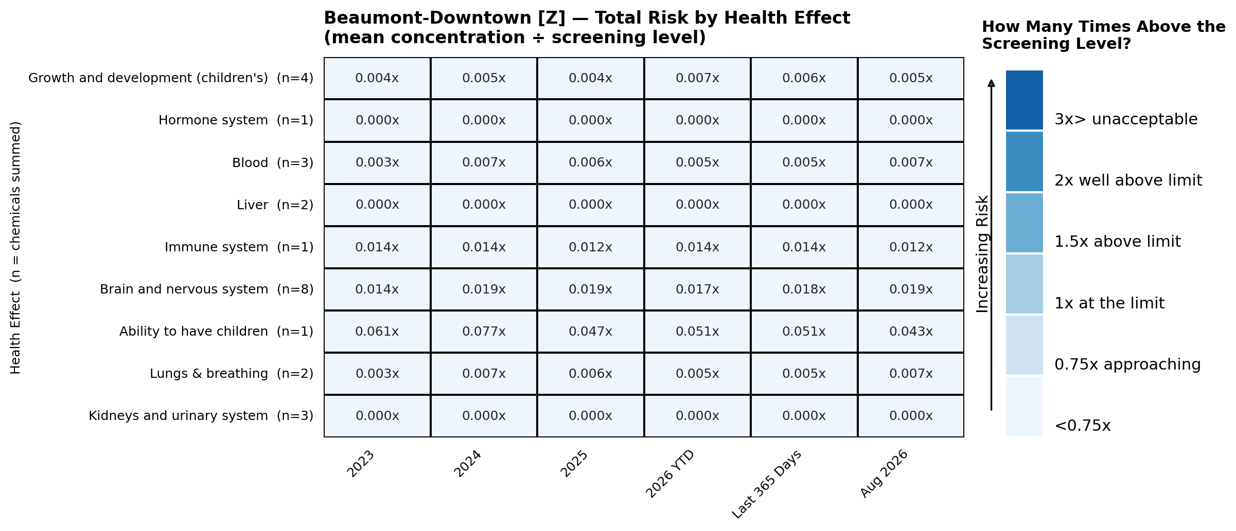
Other Health Risk Pollutants shows one plot per health effect, comparing pollutants against the screening level. Every value here is currently well below 1.0x, so these grids appear in the palest shade.
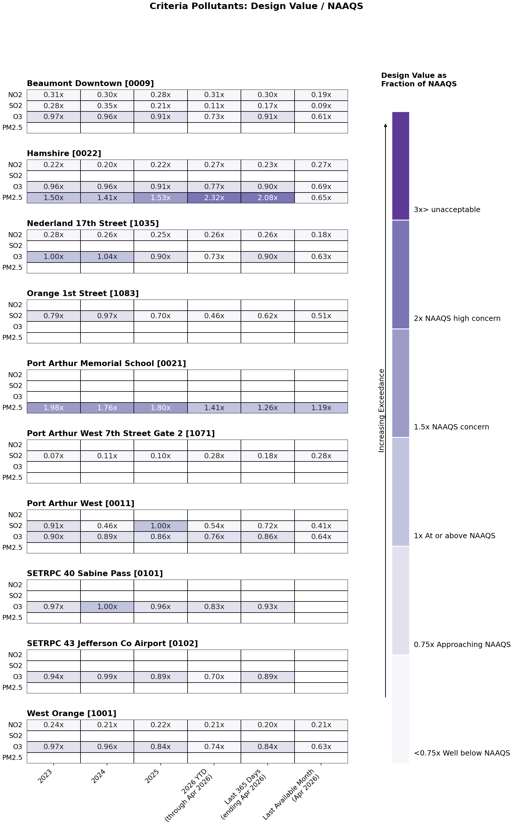
EPA Criteria Pollutants works differently: it compares the EPA design value against the National Ambient Air Quality Standard rather than a screening level, and it covers ten monitors rather than two. A design value is a number calculated from air monitoring data that represents pollution levels in an area and is used to determine whether the area meets an air quality standard. Below 1.0x is within the standard.
A fuller explanation is in the Frequently Asked Questions, and each group’s own tab has a worked example.

One heatmap per monitor. Each row is a cancer risk pollutant with the cancer type it is associated with, and each cell is the measured average level divided by the Screening Level. The bottom row combines the pollutants into a total. A value below 1.00x is below the screening level; above 1.00x means the level exceeds it.
To see these pollutants broken out by location on their own page, visit Cancer Risk by Location.
One heatmap per monitor. Each row is a part of the body targeted by the pollutant and each cell is the total for that effect: the levels of every pollutant affecting that body system, added together and divided by the screening level. A screening level is the concentration at or below which EPA does not expect health effects. The (n=) beside each effect is the total number of pollutants considered in the calculation.
To see the pollutants one by one, visit Other Health Risks by Pollutants and Location. To see which individual pollutants drive each health effect, visit Other Health Risks by Health Indicator.
The Clean Air Act identifies 6 air pollutants that pose the greatest health risks. They are known as criteria pollutants. This section tracks four EPA criteria pollutants, sulfur dioxide (SO₂), nitrogen dioxide (NO₂), ozone (O₃), and fine particle pollution (PM2.5), measured at TCEQ regulatory monitors near the Beaumont, Port Arthur community. The EPA uses air monitoring data to determine if pollution levles meet the Clean Air Act requirements. They make these decisions based on a number representing all the measurements over a year taken at an air monitor. This number is called a Design Value. In the figure, each cell shows the EPA Design Value for that pollutant divided by the corresponding National Ambient Air Quality Standard (NAAQS). A value below 1.0 means the design value is within the standard; values above 1.0 indicate the yearly average is greater than the Clean Air Act (NAAQS) standard and poses an increased health risk.
Design values are computed using the same statistics EPA uses to determine if air pollution levels in the region are meeting the criteria set by the Clean Air Act:
| Pollutant | NAAQS | Design Value Method |
|---|---|---|
| SO₂ | 75 ppb (1-hour) | 99th percentile of daily 1-hr maximum concentrations |
| NO₂ | 100 ppb (1-hour) | 98th percentile of daily 1-hr maximum concentrations |
| O₃ | 0.070 ppm (8-hour) | 4th-highest daily maximum 8-hr average concentration |
| PM2.5 | 9 µg/m³ (1-year) | Mean or average |
For the yearly columns (2022–2025), each value represents a single-year design value ratio. EPA AQS releases data on a delay of weeks to months, so the criteria-pollutant data usually ends before the TCEQ data on the other tabs. The three moving-window columns say, on a second line of their heading, which month their data actually ends in: “YTD (through …)” covers January 1 to the last available day; “Last 365 Days (ending …)” is the 365 days ending on the last available day; and “Last Available Month” is that final month by itself. All three use the same design value methodology.