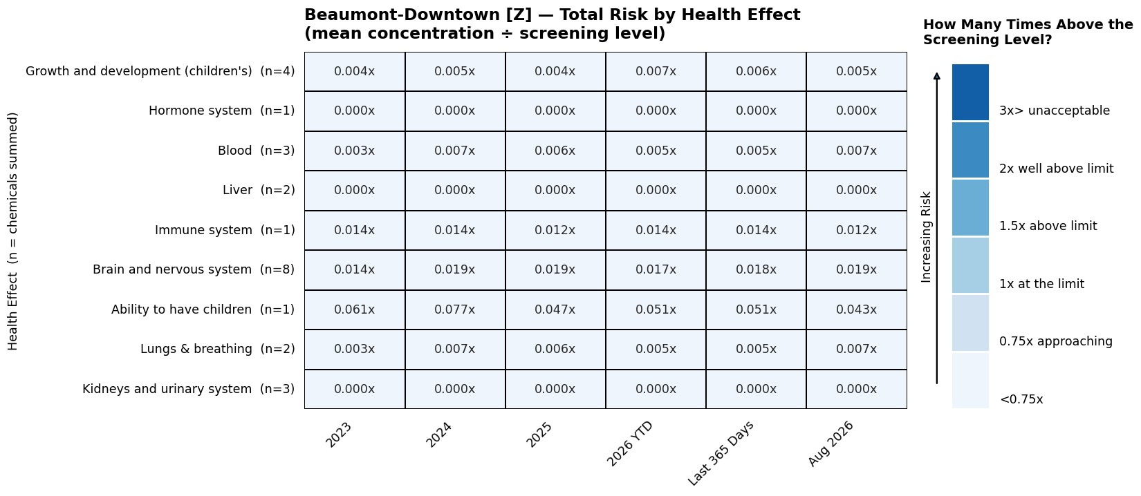
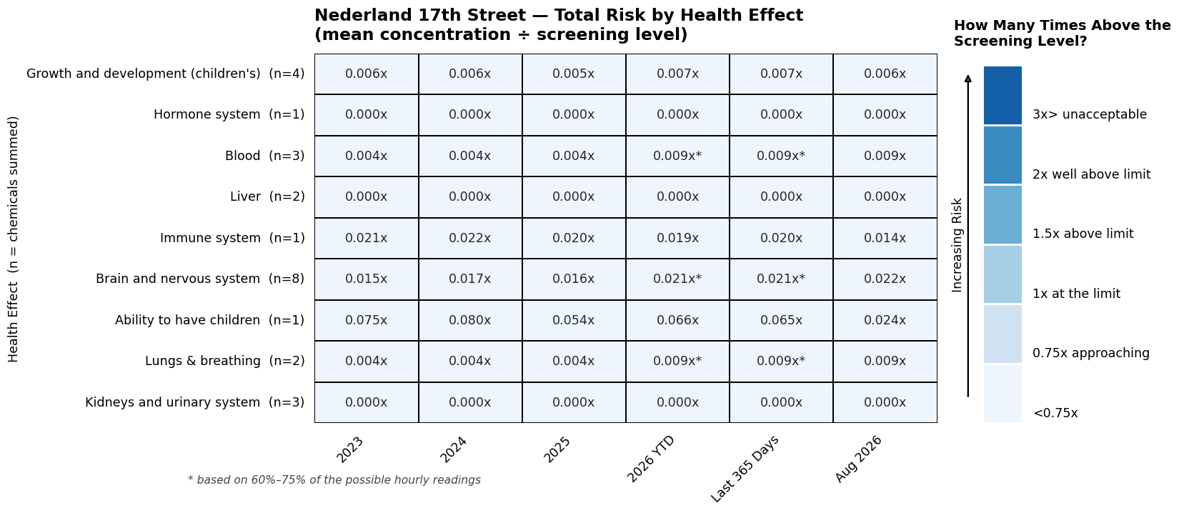
This view reorganizes the other health risk pollutants around geographic location rather than health system effected. Each location card shows one row per health system, and each cell is the combined total — the levels of every chemical that contributes to it, each divided by its screening level and then added together. This is the same “Total” reported for each health effect on the main dashboard, so the two pages agree.
A value below 1.00x means the combined exposure sits below the screening level for that body system; 1.00x is the screening level itself. The (n=) in each row label is the number of chemicals contributing to that total — Brain and Nervous system effects combine 8 chemicals, while Immune system and Reproductive system (or ability to have children) rest on a single chemical each, so totals are not equally well supported.
CHATTER analyzes air pollutants measured with automatic gas chromatograph (AutoGC) equipment. In Beaumont-Port-Arthur, there are only two AutoGC monitor sites that measure cancer risk pollutants analyzed by CHATTER: Beaumont-Downtown and Nederland 17th Street.
How to read this plot (click to expand)
Each row is a health effect — a body system that can be harmed, such as the nervous system or the immune system. Each column is a period of time. The number in each square is the total for that health effect: the levels of every pollutant affecting that body system, added together and divided by the screening level, written as a multiple with an “x.”
The (n=) beside each health effect is how many pollutants were added together to make that total. Brain and Nervous system effects combine 8 pollutants, while Immune and Reproductive system (or the ability to have children) each rest on a single one, so the totals are not equally well supported by the data.
A clarifying example.On the Nederland 17th Street card, find the row for Immune and the column for 2024. The square reads 0.022x. That number means the combined level of the pollutants affecting the immune system was about 2% of the screening level — in other words, well below it.
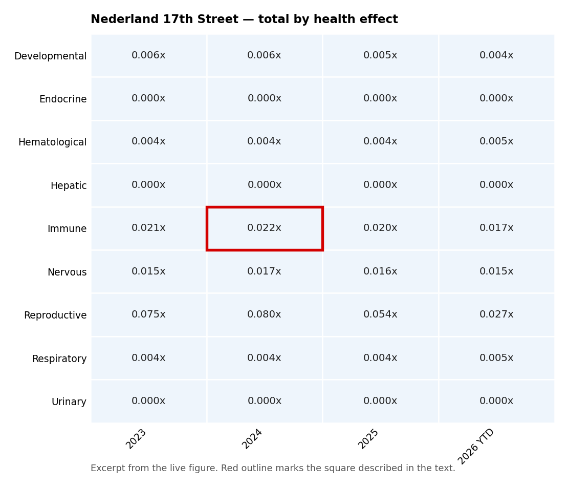
Everything on this tab is currently below the screening level. The highest total anywhere is about 0.080x, and the color scale does not begin to darken until 1.00x, where a level would reach the screening level. So the whole grid appears in the palest shade. That is the finding, not a rendering problem: for these health effects, measured levels at both monitors are far under the screening level. Read the numbers to compare pollutants and years to see changes over time; the color is telling you they are all in the same safe band.
For the general explanation of heat maps, see the Frequently Asked Questions.