About CHATTER (click to expand)
CHATTER is a tool that shows how air pollution levels change over time and what those changes could mean for people’s health in the East Houston communities along the Houston Ship Channel, from the East End to Baytown. This East Houston edition follows all fourteen hourly air-toxics (AutoGC) monitors in Harris County that report to the Texas Commission on Environmental Quality. To keep the figures readable, the monitors are grouped into the six sections drawn on the monitor map — East End; Galena Park / Pasadena; Jacinto City / Cloverleaf; Channelview / Lynchburg; Deer Park; and Baytown — and every figure on this page is one section, with its monitors side by side. While air pollution affects everyone, communities nearer industrial sources experience higher levels of hazardous air pollutants and the associated human health risk than those that are not.
CHATTER helps determine whether air pollution levels measured at local monitors may be high enough to affect human health and whether additional action may be needed to reduce exposures. Screening levels are air pollution concentrations or thresholds that scientists use to identify when long-term exposure may increase the risk of health problems. Exceeding a screening level does not mean health effects will occur, it indicates a need to take additional steps like verifying measurements or taking pollution reduction actions to protect health.
The health risks CHATTER show apply to a resident living in the area breathing air pollution for a long time.
CHATTER displays three groups of air pollutants that are monitored at the East Houston sites:
- Cancer Risk Air Pollutants: these are hazardous air pollutants that increase the lifetime risk of developing cancer.
- Other Health Risks Pollutants: these are hazardous air pollutants that increase the risk of other health conditions — for example heart, breathing, immune, and reproductive effects — other than cancer.
- EPA Criteria Pollutants: these are six common air pollutants regulated under the Clean Air Act for which the EPA has set National Ambient Air Quality Standards (NAAQS) because they can affect people’s health. Four of these common air pollutants are measured at monitors near this community.
The first two groups are of greater concern to communities living near industrial areas, where hazardous air pollutants are released. The third group consists of widespread pollutants found throughout the United States.
A reference map is included indicating the locations of the monitors and the boundaries of the six sections. Figures in CHATTER reports are based on air monitoring data from these locations. If you are interested in better understanding potential sources of air pollution at these locations, visit EDF’s AirTracker tool.
For more on definitions or how air monitors work, what a screening level is, how EPA sets them, and which statistics CHATTER uses, see the Frequently Asked Questions. Where the data come from, how each number is calculated, and a downloadable file of every value on this site are on the Data & Methods tab.
How to read the plots on this page (click to expand)
The figures below are heat maps. On this page each figure covers the whole area at once: each row is one of the fourteen monitors, grouped into the six sections of the map, and each column is a period of time, and the number in each square is the level measured at the location divided by the health-based limit, written as a multiple with an “x.” 1.0x means the level sits exactly at the limit; 0.5x is half the limit; 3.0x is three times the limit. The color legend beside each plot shows what those multiples mean. The darker the color the greater the value. A number followed by an asterisk (for example 1.72x*) rests on thinner data: between 60% and 75% of the possible hourly readings for that period were available. Periods with less than 60% are left blank rather than shown.
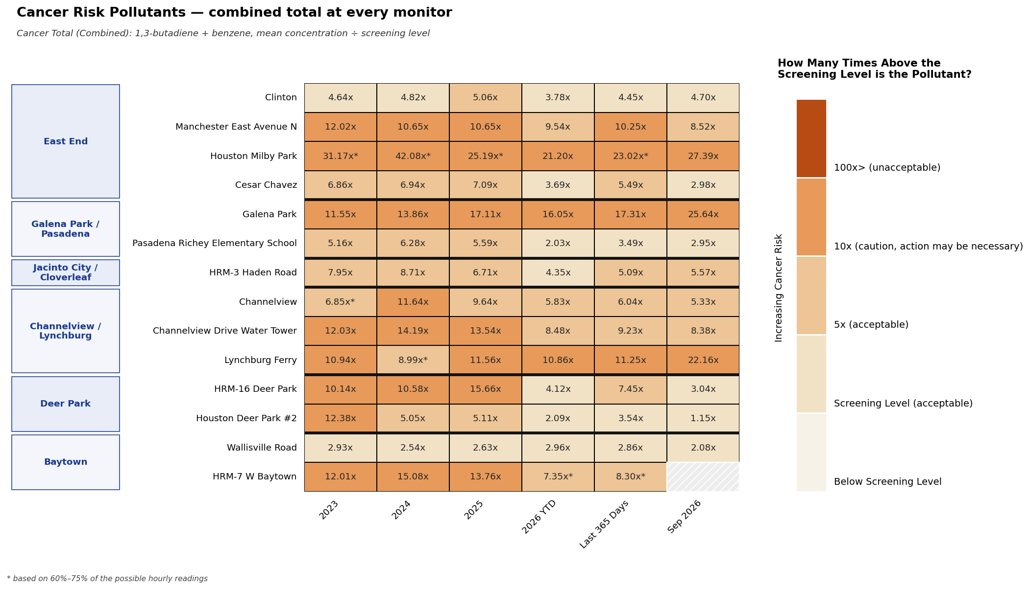
Cancer Risk Pollutants shows each monitor’s combined cancer total — its two cancer risk pollutants, each compared against its Screening Level and then added together. For example, Galena Park’s 2024 total reads 13.86x, which falls in the 10x (caution, action may be necessary) band; on the Cancer Risk by Location tab that splits into 1,3-butadiene at 6.11x and benzene making up the rest.
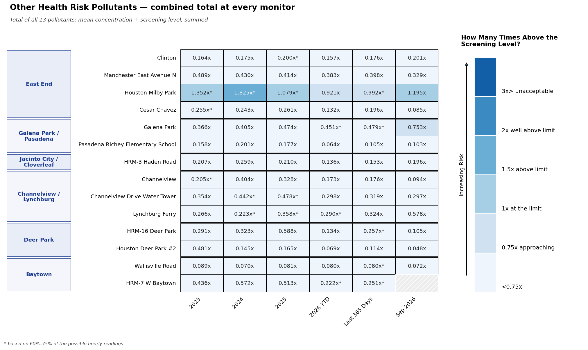
Other Health Risk Pollutants shows each monitor’s total across all thirteen of those pollutants. Most values here sit well below 1.0x and appear in the palest shade; the exception to watch is Houston Milby Park (East End), where 1,3-butadiene alone pushes the total past the screening level in several periods — the only monitor where that happens.
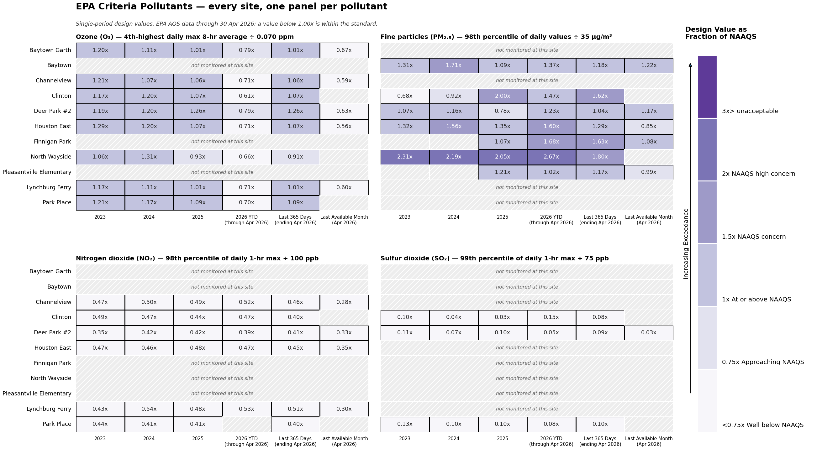
EPA Criteria Pollutants works differently: it compares the EPA design value against the National Ambient Air Quality Standard rather than a screening level, and it covers the eleven regulatory monitors within the area of the monitor map. A design value is a number calculated from air monitoring data that represents pollution levels in an area and is used to determine whether the area meets an air quality standard. Below 1.0x is within the standard.
A fuller explanation is in the Frequently Asked Questions, and each group’s own tab has a worked example.

-
East End
Clinton, Manchester East Avenue N, Houston Milby Park, Cesar Chavez -
Galena Park / Pasadena
Galena Park, Pasadena Richey Elementary School -
Jacinto City / Cloverleaf
HRM-3 Haden Road -
Channelview / Lynchburg
Channelview, Channelview Drive Water Tower, Lynchburg Ferry -
Deer Park
HRM-16 Deer Park, Houston Deer Park #2 -
Baytown
Wallisville Road, HRM-7 W Baytown
One row per monitor, grouped by map section. Each cell is the monitor’s combined cancer total for that period: the measured average level of each cancer risk pollutant (1,3-butadiene and benzene) divided by its Screening Level, then added together. A value below 1.00x is below the screening level; above 1.00x means the combined level exceeds it. Read down a column to compare monitors, or across a row to see how one monitor has changed.
To see the individual pollutants behind each total, visit Cancer Risk by Location, where every monitor has its own card.
One row per monitor, grouped by map section. Each cell is the monitor’s total across all thirteen other-health-risk pollutants for that period: each pollutant’s average level divided by its screening level, then added together. A screening level is the concentration at or below which EPA does not expect health effects. Almost every total sits well below 1.00x and appears in the palest shade; a darker cell marks a monitor and period worth a closer look on the detail tabs.
To see the pollutants one by one, visit Other Health Risks by Pollutants and Location. To see which individual pollutants drive each health effect, visit Other Health Risks by Health Indicator.
The Clean Air Act names six criteria pollutants — common air pollutants regulated under National Ambient Air Quality Standards (NAAQS). Four of them are measured at the eleven TCEQ regulatory monitors within the area of the monitor map: ozone (O₃), fine particles (PM2.5), nitrogen dioxide (NO₂) and sulfur dioxide (SO₂).
The figure has one panel per pollutant, with every site as a row; a hatched row means that site does not measure that pollutant. Each cell is the site’s EPA design value — the statistic EPA uses to judge that pollutant against its standard — divided by the NAAQS. Below 1.00x is within the standard; above 1.00x is over it. These are single-period values, not EPA’s official three-year determinations. EPA releases this data weeks to months late, so the last three columns say which month they end in.
How each design value is calculated, the standards used, and a card for every site are on the EPA Criteria Pollutants by Location tab.